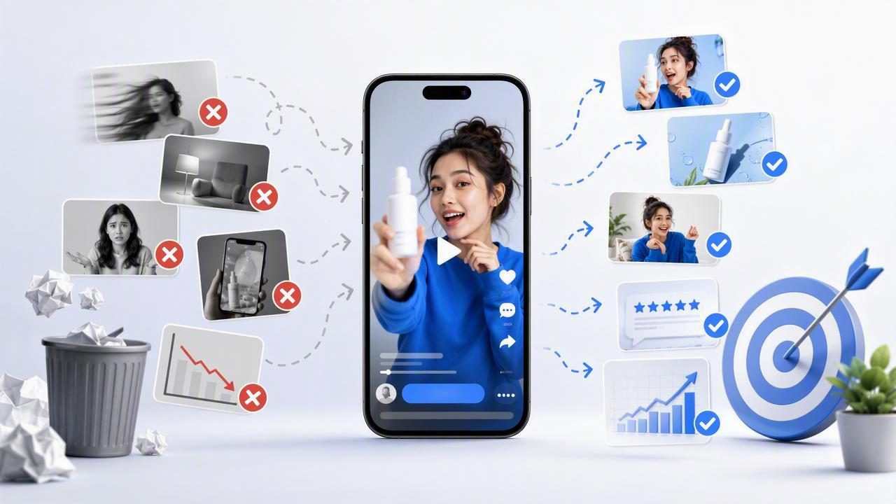
Short-form video has become a central format for paid social campaigns, product launches, and ecommerce growth. A short form ad generator can help teams turn product photography, scripts, and brand assets into fast-moving video creative without a lengthy production cycle. However, speed does not automatically create performance.
Many brands produce a high volume of video ads but still struggle with low watch times, weak click-through rates, or inconsistent conversion results. The issue is often not the tool itself. It is the creative strategy, inputs, and testing process behind it. Understanding the most common short form ad generator mistakes to avoid helps marketers create videos that feel native to the platform while clearly communicating why a product matters.
Below are 15 mistakes that can limit short-form ad performance, along with practical ways to improve your video marketing workflow.
1. Starting Without a Clear Campaign Goal
A short video cannot do every job at once. Trying to build awareness, explain every feature, collect email signups, and drive an immediate purchase in a 15-second ad usually creates a cluttered message.
Before generating creative, define one primary outcome. For example, a cold-audience campaign may focus on stopping the scroll and introducing a product benefit. A retargeting campaign may focus on objections, proof, or a limited-time offer.
- Awareness: Lead with a relatable problem or bold visual.
- Consideration: Demonstrate how the product works.
- Conversion: Emphasize proof, value, urgency, and a clear call to action.
A defined objective gives every scene a purpose and makes creative performance easier to assess.
2. Using Product Photos That Are Not Ready for Motion
Photo-to-video tools can add movement and energy, but they cannot fully compensate for weak source material. Blurry images, inconsistent lighting, busy backgrounds, or tiny product details can make generated videos feel unpolished.
Prepare product photography before uploading it. Use high-resolution images, show the product at a useful scale, and select angles that make key details easy to understand. Clean studio images are valuable, but lifestyle photos can add context by showing where, when, or how the product is used.
Great short-form creative begins with visuals that communicate even when the viewer watches with sound off.
3. Burying the Hook in the First Few Seconds
One of the most expensive short form ad generator mistakes is treating the opening like a traditional commercial. Social audiences decide quickly whether content deserves attention. Starting with a slow logo animation, a broad brand statement, or an empty product shot can lose viewers before the message begins.
Open with a hook that creates curiosity, identifies a problem, or shows an immediate outcome. Strong opening approaches include:
- “I stopped buying this after I found a better option.”
- A close-up product reveal paired with a bold benefit.
- A before-and-after visual transformation.
- A common frustration the audience instantly recognizes.
- A direct question such as, “Why is nobody talking about this?”
The hook should match the landing page and product promise. Sensational claims may improve initial views but can harm trust and conversion quality.
4. Trying to Explain Too Much
Short-form ads work best when they communicate one main idea. Brands often overload videos with features, ingredients, customer quotes, prices, offers, and multiple calls to action. The result is an ad that feels rushed and difficult to remember.
Choose a single message for each variation. A skincare ad might focus on one visible concern. A kitchen product ad might focus on one time-saving use case. A software ad might demonstrate one workflow improvement. Additional benefits can appear in follow-up ads, retargeting creative, or the product page.
5. Writing Generic Scripts
“Our product is high quality” and “Shop now for the best results” are not compelling on their own. Generic language could describe nearly any brand, so it gives viewers little reason to keep watching.
Use specific, customer-centered language instead. Replace broad statements with tangible details:
| Generic Copy | More Specific Alternative |
|---|---|
| Made for busy people | Ready in under two minutes before your morning commute |
| Comfortable all day | Soft stretch fabric that stays smooth through long workdays |
| Easy to use | Attach, twist, and go—no tools or setup required |
| High-quality results | Creates a polished finish without streaks or extra layers |
Pull language from reviews, support tickets, and customer interviews. These sources reveal the phrases real buyers use when describing their problems and desired outcomes.
6. Ignoring Native Platform Style
A vertical video is not automatically platform-native. Viewers on TikTok, Instagram Reels, YouTube Shorts, and other feeds expect a quick pace, readable captions, natural-looking scenes, and an authentic tone.
Overly polished ads can still work, but they need a strong concept. Consider mixing polished product photography with creator-style framing, quick cuts, text overlays, hands-on demonstrations, or testimonial-inspired narration. The goal is not to imitate every trend blindly. It is to make the ad feel appropriate for the environment where it appears.
7. Forgetting Sound-Off Viewing
Many people watch social video with sound muted, especially in public places. If the only explanation appears in voiceover, the core message may never reach the viewer.
Use on-screen text to reinforce the hook, product benefit, and call to action. Keep captions concise and large enough to read on a mobile screen. Avoid placing critical text too close to the edges, where platform interface elements may cover it.
At the same time, do not rely on text alone. Audio, music, and voiceover can still add pace, emotion, and clarity for viewers who listen.
8. Choosing Visuals That Do Not Match the Claim
Visual storytelling is strongest when viewers can see the benefit being described. If an ad claims a product saves time, show a rapid process. If it claims to solve a mess, show the mess and the solution. If it claims to improve organization, show the organized result.
Mismatch creates friction. A static product image paired with an ambitious claim may look less credible than a simple, relevant demonstration. When using a short form ad generator, map each line of copy to a supporting visual before generating the final video.
9. Overusing Templates Without Brand Adaptation
Templates provide useful structure, but blindly using the same transitions, fonts, pacing, and layouts can make every ad look interchangeable. A recognizable brand identity is important for long-term brand engagement.
Create a flexible visual system that includes approved fonts, color accents, logo use, image treatments, and voice guidelines. Then adapt that system to different concepts rather than forcing every concept into one rigid format. Consistency should make the brand recognizable, not repetitive.
10. Making the Product Too Small or Too Late
Short-form ads should not hide the item being sold. While a curiosity-driven opening can be effective, viewers need to see the product early enough to connect it with the promised outcome.
Use clear close-ups, in-use shots, packaging reveals, and simple product labels. For products with small details, include a zoomed image or a brief visual callout. The viewer should know what is being offered without needing to replay the video.
11. Skipping Social Proof
Especially for unfamiliar brands, proof reduces hesitation. Social proof can include customer ratings, review excerpts, user-generated clips, expert mentions, repeat purchase statistics, or a clear demonstration of product results.
Keep proof truthful and verifiable. Avoid vague phrases such as “everyone loves it” when a specific, supportable statement would be more convincing. Even a concise overlay like “4.8 stars from 2,000+ verified buyers” can strengthen a conversion-oriented ad when accurate.
12. Using Weak or Confusing Calls to Action
A viewer may enjoy an ad and still do nothing if the next step is unclear. Every video does not need an aggressive sales message, but it should guide the audience toward an action that matches the campaign goal.
- “See how it works” for a product demonstration.
- “Find your shade” for a beauty product.
- “Explore the collection” for a broader catalog.
- “Get yours before the offer ends” for a time-sensitive promotion.
Use one primary call to action. Multiple competing requests can dilute urgency and confuse the viewer.
13. Generating One Version and Calling It Testing
Creative testing is not simply producing several videos with different colors or music. Meaningful testing isolates a variable so you can learn why an ad performs.
Test major creative angles first: different hooks, customer problems, offers, proof types, or product use cases. Once an angle performs, refine execution through pacing, text placement, visuals, and calls to action.
- Create three to five distinct message angles.
- Build two or more hook variations for each angle.
- Keep the landing page and audience stable where possible.
- Review attention, click, and conversion metrics together.
- Develop new iterations from the strongest insight.
14. Looking Only at Click-Through Rate
A high click-through rate can indicate a strong hook, but it does not always mean the ad is driving profitable customers. Likewise, a lower-click ad may generate better conversion quality because it sets clearer expectations.
Evaluate performance across the funnel. Monitor thumb-stop rate or early retention, average watch time, click-through rate, landing-page conversion rate, cost per acquisition, and return on ad spend. The right metric depends on campaign stage, but the final decision should connect creative engagement to business results.
15. Failing to Refresh Winning Creative
A winning ad will eventually lose efficiency as audiences see it repeatedly. Creative fatigue often appears as declining watch time, higher costs, or reduced click-through rates. Do not wait until performance collapses to make new assets.
Refresh successful concepts by changing the opening line, first image, testimonial, product photo, use case, or offer. Preserve the core insight that worked while presenting it in a new way. This approach is faster and more strategic than constantly starting from zero.
A Practical Pre-Publish Checklist
Before launching a generated video ad, ask the following:
- Is the campaign goal clear?
- Does the first three seconds create immediate interest?
- Can viewers understand the product with sound off?
- Does each visual support the message on screen?
- Is the product visible early and clearly?
- Is there one memorable benefit and one main call to action?
- Does the format fit the target platform and mobile screen?
- Have you created deliberate variations to test?
Turn Faster Production Into Better Creative
The best short-form ads combine efficient content creation with disciplined creative thinking. Avoiding these short form ad generator mistakes helps brands make stronger use of product photography, deliver clearer stories, and build video marketing assets that earn attention instead of simply filling a feed.
Start with a sharp audience insight, build each ad around one promise, and use performance data to guide the next iteration. Platforms such as UGCMade can make it easier to transform product visuals into video variations, but the strongest results come from pairing production speed with a thoughtful testing strategy.