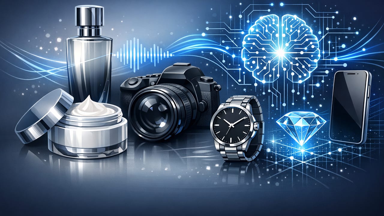
Luxury marketing lives and dies by perceived value. The tiniest mismatch in color, texture, typography, or motion can make a premium item feel ordinary—or worse, counterfeit. That’s why teams exploring premium AI visuals for luxury products need more than “make it look cool” prompts. You need a workflow that preserves brand codes, respects product truth, and ships content fast without compromising elegance.
This guide walks through a practical, brand-safe system for turning high-quality product photos into refined AI-enhanced visuals and short videos—ideal for product pages, lookbooks, ads, and social.
What “premium” means in AI visuals for luxury
In luxury, “premium” isn’t just 4K resolution. It’s the sum of small signals that communicate craft, scarcity, and confidence:
- Material fidelity: metals, gemstones, leather grain, glass refraction, fabric weave.
- Color accuracy: consistent hues across scenes, lighting setups, and devices.
- Controlled composition: negative space, clean lines, intentional framing.
- Restrained motion: slow, smooth camera moves and transitions (no “template-y” chaos).
- Brand coherence: type, spacing, tone, and micro-details that match your house style.
AI can help you scale variations and produce motion from stills, but premium output requires constraints: brand rules, technical specs, and QA.
Step 1: Lock the brand codes (before you open any AI tool)
Start with a one-page “visual constitution.” If you don’t have one, create it—this alone improves consistency across creators, agencies, and AI outputs.
Brand codes to document
- Color palette: primary, secondary, neutrals; include HEX + usage rules (backgrounds vs accents).
- Typography: exact fonts, weights, letter spacing, and when to use serif vs sans.
- Lighting style: high-key editorial, low-key moody, hard specular highlights, soft diffused, etc.
- Texture rules: avoid fake “sparkle” overlays; keep gradients smooth; no plastic-looking skin on metals.
- Motion language: max speed, preferred easing (gentle ease-in-out), camera moves allowed.
- Do-not list: cheap lens flares, glitch effects, over-saturation, harsh sharpening, AI “melt” artifacts.
Luxury tip: If you can describe your brand in one adjective only, you’ll create generic work. Use a small set of specific constraints (e.g., “quiet, architectural, tactile, warm”).
Step 2: Prepare your source photos like a post-production team would
AI amplifies whatever you feed it. For premium AI visuals for luxury products, start with the cleanest possible assets.
Photo prep checklist
- Use consistent white balance: mixed lighting is the #1 cause of “off” gold and inaccurate blacks.
- Retouch dust and micro-scratches: luxury viewers notice everything.
- Keep edges crisp: hairline chamfers, prong settings, and embossed logos must stay sharp.
- Export high quality: use PNG or high-quality JPG; avoid tiny images that force upscaling artifacts.
- Separate layers if possible: product cutout + shadow + background enables controlled composites.
Step 3: Choose the right AI approach (and know the trade-offs)
There are three common ways to produce premium-looking AI visuals from product photos. Your choice depends on brand risk tolerance, volume, and timeline.
| Approach | Best For | Strengths | Risks |
|---|---|---|---|
| Subtle enhancement (color/contrast/cleanup) | Ecommerce galleries, PDP consistency | Lowest brand risk, high accuracy | Less “wow” if lighting is weak |
| Motion from stills (parallax, gentle camera) | Short ads, social, hero banners | Feels premium when motion is restrained | Bad depth guesses can warp edges |
| Context generation (new backgrounds/sets) | Campaign variants, seasonal scenes | Fast creative testing at scale | Highest risk: inaccurate reflections, “fake” textures |
For luxury, a smart default is: keep the product real, stylize the world around it. The product must remain truthful; the environment can carry the mood.
Step 4: Design “luxury motion”: slow, minimal, tactile
Premium visuals often feel expensive because they’re calm. Instead of rapid cuts, use controlled movement that reveals craft.
Motion patterns that read as premium
- Micro-tilt + push-in: a 2–5% scale push over 2–4 seconds.
- Parallax layers: separate product / shadow / background for depth without distortion.
- Detail reveals: start wide, then cut to macro detail (engraving, clasp, stitching).
- One hero transition: a single elegant cross-dissolve or match cut—no noisy wipes.
What to avoid
- Over-sharpening (creates crunchy edges on metals and leather).
- High-frequency film grain (often looks like compression noise on mobile).
- Fast zooms and “kinetic typography” unless it’s truly your brand language.
Step 5: Keep product truth intact (compliance + trust)
Luxury shoppers are detail-oriented and return rates are expensive. AI visuals should not imply features you don’t sell.
Brand-safe rules
- Don’t change materials: gold should not become rose gold; matte should not become glossy.
- Don’t alter silhouettes: prongs, bezels, bag seams, bottle shapes must remain exact.
- Don’t invent accessories: extra straps, charms, stones, or packaging you don’t include.
- Be careful with “implied scale”: keep props realistic to avoid misleading size cues.
If you’re generating context scenes, treat them like set dressing: beautiful, but never competing with the product or confusing the buyer.
Step 6: Use specs that preserve polish (platform-ready without looking compressed)
“Premium” can be lost in export. Use formats that protect gradients, blacks, and fine texture.
| Placement | Aspect Ratio | Resolution | Length | Notes |
|---|---|---|---|---|
| PDP / Website hero | 16:9 or 1:1 | 1920×1080+ (or 1080×1080) | 6–12s loop | Keep motion subtle; optimize file size carefully |
| Social (feed) | 4:5 or 1:1 | 1080×1350 or 1080×1080 | 6–15s | Front-load the hero angle in first 1–2 seconds |
| Stories / Reels | 9:16 | 1080×1920 | 7–20s | Leave safe margins for UI overlays |
Example: clean export with FFmpeg
If you need consistent, high-quality H.264 exports (common for ads), this is a solid baseline:
ffmpeg -i input.mp4 \
  -c:v libx264 -profile:v high -level 4.1 \
  -pix_fmt yuv420p -crf 18 -preset slow \
  -movflags +faststart \
  -c:a aac -b:a 192k \
  output.mp4
Notes: CRF 18 is high quality for most product visuals. If gradients band, test CRF 16–18 and avoid heavy sharpening.
Step 7: Build a repeatable QA checklist (the “luxury gate”)
A simple QA gate prevents subtle mistakes from scaling across an entire catalog.
Quality assurance checklist
- Color: compare against a known-good reference image; check gold tones and deep blacks.
- Edges: zoom to 200% and inspect logos, corners, stitching, prongs, and caps.
- Reflections: ensure they’re plausible (no impossible light sources or mirrored nonsense).
- Typography: correct font, kerning, and safe margins; no pixel shimmer.
- Compression: watch on mobile; look for banding in gradients and noise in shadows.
- Truthfulness: confirm no added/deleted features; verify claims match product specs.
When in doubt, prioritize accuracy and restraint over novelty. Premium is often what you choose not to do.
Step 8: Measure what matters (beyond views)
Luxury brands often optimize for brand lift, but you can still run practical performance checks without cheapening the creative.
- PDP engagement: video play rate, average watch time, scroll depth, add-to-cart after play.
- Creative A/B tests: one variable at a time (background tone, first frame, headline).
- Return/CS signals: watch for complaints tied to color/material mismatch.
A strong benchmark: if your video increases product understanding (materials, scale, finish) without increasing confusion, you’re moving in the right direction.
Practical example: a “quiet luxury” 10-second video from 3 photos
Here’s a simple storyboard that consistently feels high-end:
- 0–2s: hero still (front angle) + gentle push-in; minimal headline (3–5 words).
- 2–6s: macro detail shot (texture/engraving) with slow lateral move.
- 6–10s: side profile + short line about material/craft; end on logo lockup.
This approach avoids over-stylization while still delivering motion and tactile detail—ideal for premium AI visuals for luxury products where trust is as important as aesthetics.
FAQ
Will AI visuals make my luxury brand look “mass market”?
Only if you rely on generic templates, exaggerated effects, or inconsistent styling. With tight constraints, careful photo prep, and restrained motion, AI-assisted production can look editorial rather than automated.
How many variations should I test without diluting the brand?
Start with 2–3 variations per product: one “core” brand look, one slightly bolder lighting mood, and one platform-specific crop (e.g., 9:16). Keep typography and color rules consistent.
What’s the safest place to start?
Begin with motion-from-stills on existing product photos. It’s typically lower risk than full scene generation and still delivers a premium upgrade on PDPs and ads.
Conclusion
Luxury audiences reward clarity, craft, and restraint. The best premium AI visuals for luxury products don’t scream “AI”—they quietly elevate what’s already great: materials, finishing, and brand codes. Build a brand-safe foundation, choose the right AI approach, export with care, and use a strict QA gate.
If you’re exploring ways to turn high-quality product photos into refined video assets with minimal manual editing, platforms like UGCMade can fit into this workflow as a production step—just keep your brand rules and QA standards in the driver’s seat.