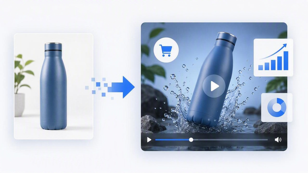
A strong product image to video ad can help brands turn existing product photography into attention-grabbing marketing creative without planning an entirely new video shoot. For ecommerce teams, small businesses, and agencies, this approach offers a practical way to create more content, test more messages, and keep paid social campaigns visually fresh.
Static product images are still essential for product pages, catalogs, and display ads. However, video adds motion, pacing, sound, and narrative structure—elements that can make people pause while scrolling and understand a product faster. The goal is not to add movement for its own sake. The goal is to use visual storytelling to communicate a clear customer benefit and encourage the next action.
This guide explains how to build effective video ads from product photos, choose the right creative elements, and optimize each asset for stronger brand engagement.
Why Turn Product Images Into Video Ads?
Video marketing gives a product more context than a single image can provide. A still photo can show color, texture, shape, and packaging. A short video can show how the product fits into a routine, highlight a problem it solves, reveal key details in sequence, and reinforce a call to action.
Converting product photography into video is particularly useful when you need creative volume quickly. Rather than relying on one polished campaign video for months, marketers can produce multiple focused variations using the same approved images. Each variation can test a different opening hook, benefit statement, audience segment, offer, or visual style.
- More efficient content creation: Repurpose photography already created for a catalog, launch, or product page.
- Better message testing: Compare claims, hooks, captions, and calls to action without reshooting assets.
- Stronger mobile presence: Motion can help product creative stand out in fast-moving vertical feeds.
- Clearer product education: Layer text and image sequences to explain features in seconds.
- Consistent brand presentation: Use approved fonts, colors, and imagery across multiple campaigns.
The most successful product image to video ad does not try to tell every part of the brand story at once. It focuses on one audience, one product angle, and one next step.
Start With the Ad Objective, Not the Animation
Before choosing transitions, music, or effects, define what the ad needs to accomplish. The objective determines the creative structure. A prospecting ad aimed at new audiences usually needs a fast hook and simple explanation. A retargeting ad can spend more time on proof, product details, or an offer because viewers may already recognize the brand.
| Campaign goal | Best video focus | Useful image types |
|---|---|---|
| Awareness | Problem, aspiration, and memorable brand visual | Lifestyle scenes, hero images, bold close-ups |
| Traffic | Clear product value and a direct reason to click | Product-in-use images, benefit callouts |
| Conversions | Benefits, proof, offer, and simple CTA | Detail shots, reviews, bundles, product photos |
| Retargeting | Objection handling and urgency | Feature photos, comparison images, testimonials |
Write one sentence that summarizes the creative before production begins. For example: “Show busy commuters how this insulated bottle keeps drinks cold all day, then invite them to choose a color.” This statement prevents the video from becoming a collection of disconnected animated photos.
Choose Product Photography That Works in Motion
Not every product image needs elaborate animation. In fact, clean, high-resolution photography often performs best with subtle movement. Start with a small collection of images that give the viewer different levels of information.
Build a Useful Image Set
- Hero image: A clear, attractive view of the product for the opening or closing frame.
- Detail image: A close-up of texture, ingredients, materials, controls, or packaging.
- Context image: The product in a real-life environment or beside related objects for scale.
- Outcome image: A visual that supports the result, feeling, or lifestyle benefit.
- Proof image: A review, rating, award, comparison, or customer quote presented accurately.
Images should be sharp enough for the final placement. A square catalog photo can work in a vertical ad, but it may require a background extension, a crop, or layered design treatment. Avoid enlarging low-resolution files too far; pixelation makes an ad feel less trustworthy and can undermine product quality.
Also consider visual variety. If all photographs use the same angle and background, the resulting video can feel repetitive. Combining one hero image, one close-up, and one lifestyle photo gives the edit natural pacing even when movement is minimal.
A Simple Product Image to Video Ad Structure
Short ads need a logical sequence. A reliable format is the hook-benefit-proof-action framework. It works across many product categories because it mirrors how customers make quick decisions.
- Hook (0–2 seconds): Lead with a question, tension point, surprising claim, or visually striking product shot.
- Benefit (2–6 seconds): Show the most relevant customer outcome rather than listing every feature.
- Proof (6–10 seconds): Add a product detail, a concise review, a demonstration image, or a credible differentiator.
- Action (final 2–3 seconds): Present the product, brand identifier, and a direct call to action.
For example, a skincare brand might begin with the text, “Dry skin by noon?” over a close-up product image. The next frame could show “Lightweight hydration that lasts” with a lifestyle photo. A third frame may highlight key ingredients or a verified customer rating. The final frame can show the product lineup with “Find your daily routine.”
Keep on-screen copy concise. Viewers should be able to understand each frame without pausing. Instead of “Our advanced formula was developed to provide exceptional moisturizing benefits throughout your demanding day,” write “Hydration that keeps up.”
Use Motion to Direct Attention
Motion should clarify the message, not compete with it. Gentle zooms, pans, layered depth, text reveals, and product cutouts can make still photography feel dynamic. The best choice depends on what the viewer needs to notice first.
Effective Motion Techniques
- Slow push-in: Draws attention to a hero product or important detail.
- Pan across an image: Helps reveal a product scene or create a sense of scale.
- Foreground and background separation: Adds depth by moving product and background at slightly different speeds.
- Text-led transitions: Uses benefit statements to guide viewers from one image to the next.
- Sequential detail reveals: Introduces features one at a time instead of overwhelming the frame.
Avoid rapid transitions simply because a platform favors short-form video. Fast pacing is useful when it supports energy and clarity, but too many visual changes can make a product harder to recognize. Give the hero product enough screen time to be remembered.
Good video creative makes the message easier to absorb. Great video creative makes the product easier to imagine owning.
Write Hooks and Captions for Sound-Off Viewing
Many people encounter ads with sound off, especially in public places or during work hours. Design every product image to video ad so that core meaning is visible without audio. Captions, headlines, and text overlays should carry the essential message, while music and voiceover add emotional support rather than critical information.
Strong hooks usually speak to a recognizable desire, frustration, or use case. Try adapting these patterns:
- “The [product category] upgrade your routine needs.”
- “Still dealing with [common problem]?”
- “Made for [specific audience or situation].”
- “One small change for [desired outcome].”
- “Why customers keep coming back for this.”
Be specific when possible. “Meet your new travel essential” is more vivid than “Shop our newest product.” If you use claims about performance, results, pricing, sustainability, or customer satisfaction, ensure they are accurate and supported. Trust is a major part of conversion-focused visual storytelling.
Format Ads for Each Placement
Creative that looks polished in one placement may feel awkward in another. Vertical video is generally ideal for mobile-first feeds and stories, while square and landscape formats may still be relevant for certain placements, websites, and video platforms. Plan crops early so headlines and products do not get cut off.
| Format | Best use | Practical guidance |
|---|---|---|
| 9:16 vertical | Stories, reels, short-form feeds | Use large text and keep key details near the center. |
| 4:5 vertical | Mobile feed ads | Prioritize a prominent product and readable headline. |
| 1:1 square | Flexible social placements | Useful when product photos are already square. |
| 16:9 landscape | Web video and certain video placements | Use wider lifestyle imagery and concise text. |
Leave visual breathing room around logos, calls to action, and legal text. Platform interface elements can cover the edges of vertical creative, so avoid putting critical copy too close to the top or bottom.
Test Variables Without Changing Everything
Testing is where a scalable content creation process becomes more valuable. A single product photo set can support multiple ads, but useful tests should isolate a meaningful variable. If you change the hook, imagery, offer, duration, and call to action all at once, it becomes difficult to learn why one version performed better.
Start by testing one of these variables:
- The first-frame product image versus a lifestyle image
- A problem-focused hook versus a benefit-focused hook
- Customer proof versus feature proof
- Short copy versus a more explanatory message
- A product-only closing frame versus a bundle or offer frame
Review results alongside the campaign goal. View-through rate can indicate whether the opening is compelling, while click-through rate may reveal whether the message generates interest. Conversion performance, cost per acquisition, and landing-page behavior provide a fuller picture of whether the ad is attracting the right audience.
Common Mistakes to Avoid
Even high-quality product photography can lose impact when the edit lacks focus. Watch for these common issues:
- Starting too slowly: Put the product, problem, or benefit on screen immediately.
- Using too much copy: One clear idea per frame is easier to process.
- Hiding the product: Do not make viewers wait until the end to see what is being sold.
- Overusing effects: Excessive motion can distract from product details and brand identity.
- Forgetting the CTA: Tell the viewer what to do next, even if the action is simply “Explore shades” or “Learn more.”
- Ignoring consistency: Align colors, typography, voice, and claims with the rest of the customer experience.
Turn Existing Images Into a Repeatable Video System
The strongest product image to video ad strategy is repeatable. Create a library of approved product photos, benefit statements, proof points, brand templates, and calls to action. Then organize creative around product categories, customer problems, seasons, and campaign stages. This makes it easier to produce new variations while preserving quality and consistency.
Start small: choose one product, one audience, and three distinct hooks. Build short video versions from the same image set, launch them with a clear test plan, and use results to guide the next batch. As you learn which messages drive attention and action, product photography becomes more than a catalog asset—it becomes a flexible engine for video marketing and brand engagement.
Tools such as UGCMade can help teams streamline this photo-to-video workflow while keeping the emphasis on a clear story, useful product information, and creative testing.