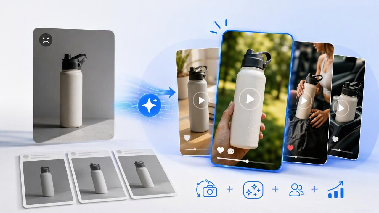
When an ad campaign starts to feel repetitive, the problem is not always the product, audience, or offer. Often, the creative has simply become too familiar. People have seen the same product image, headline, color treatment, and video opening enough times that it no longer earns attention.
One practical way to refresh tired ad creative with AI UGC video generator concepts is to start with a product photo you already have. Rather than treating that image as a finished asset, use it as a consistent visual reference for several creator-style video ideas. This makes it easier to compare different hooks, use cases, and storytelling angles without changing the core product presentation every time.
The important distinction is that an AI-generated UGC-style video concept is creative material for evaluation, not proof of a product result. It can help a team explore how an ad might frame a product, but it cannot verify performance claims, customer reactions, product efficacy, or campaign outcomes. Keeping that boundary clear leads to more credible, useful video marketing.
Why Ad Creative Becomes Tired
Creative fatigue happens when a familiar message loses its ability to interrupt scrolling or create curiosity. This can occur even when the product photo is attractive and the ad copy is technically correct. The issue is usually repetition in the presentation, not necessarily a failure in the product itself.
Common signs of tired creative include:
- Every asset opens with the same polished product shot.
- Multiple ads use nearly identical headlines and calls to action.
- The product is shown without a relatable problem or context.
- Campaigns focus on features but rarely demonstrate a real-life use moment.
- New formats are created, but the underlying message never changes.
Refreshing creative does not require abandoning brand consistency. A product photo can remain the visual anchor while the video concept changes around it. For example, one concept can lead with a morning routine problem, while another leads with an unboxing-style reaction or a quick comparison of an old habit versus a new one.
Start With One Product Photo, Not One Generic Video Idea
A strong product image gives an AI video concept a stable reference point. Before generating or reviewing any UGC-style direction, inspect the image for details that should remain consistent: packaging shape, label readability, product color, scale, texture, and any important accessories.
Choose a photo that makes the product easy to understand. A clean image with clear lighting and a visible front label is generally more useful than a highly stylized image where the product is partially hidden. If the product is small, include an image where its size can be interpreted through a hand, countertop, desk, or other realistic reference.
Then identify the single message each video concept should explore. Do not ask one video to communicate every feature, benefit, objection, and audience type. A focused concept is easier to assess because viewers can quickly understand what the ad is trying to say.
A concrete example: a reusable water bottle
Imagine a brand has a clear product photo of an insulated reusable water bottle on a neutral background. The existing ads all use the same headline: “Stay hydrated all day.” That message may still be relevant, but the creative can be refreshed by testing distinct story angles around the same photo.
| Concept | Opening hook | Visual story | Question to evaluate |
|---|---|---|---|
| Desk-day reset | “I kept forgetting to drink water during work.” | A creator-style desk scene, the bottle placed beside a laptop, then a simple refill moment. | Does a workday context feel more relevant than a generic hydration claim? |
| Bag-ready routine | “One thing I pack before leaving the house.” | The bottle appears near keys, headphones, and a tote bag before an on-the-go scene. | Does portability create a stronger reason to consider the product? |
| Ice test explanation | “Here is why I stopped buying disposable bottles.” | A close product shot, ice being added, and a short explanation of the reusable routine. | Does sustainability-led framing attract attention without overloading the message? |
These are creative examples, not actual customer stories or evidence that one angle will outperform another. The value lies in having three materially different hypotheses to review. The bottle stays visually recognizable, but the reason for watching changes.
Build Concepts Around a Tension, Not Just a Feature
UGC-style video often feels more natural when it begins with a small, recognizable tension. This is not a reason to manufacture dramatic problems or make unsupported claims. It is a way to give a product demonstration a human context.
For the water bottle example, “insulated stainless steel” is a feature. “My drink is warm by lunchtime” is a relatable tension. A video can move from that situation to a product-focused explanation, provided the wording stays accurate and any performance claim is substantiated by the brand.
Use this simple concept brief before creating variations:
Product: Insulated reusable water bottle
Audience moment: Long workday at a desk
Tension: Forgetting to drink water and wanting a cold drink nearby
Single message: Make hydration easier during the workday
Required visual details: Correct bottle color, lid, logo, and scale
Claim boundary: Avoid unverified temperature or health claims
This level of specificity prevents vague content creation. It also makes review easier because stakeholders can judge whether the video communicates the intended moment, rather than debating every possible marketing message at once.
Compare AI UGC Video Concepts Fairly
When the goal is to refresh ad creative, comparison matters more than volume. Generating many near-identical videos may create extra files, but it does not create meaningful learning. Instead, compare concepts where one important variable changes at a time.
For example, hold the product photo, brand colors, basic duration, and call to action steady. Change the opening problem, setting, first line, or product-use moment. This lets you identify what is different about the creative direction.
- Review the first three seconds. Is the opening understandable without sound? Does it create a reason to keep watching?
- Check product fidelity. Does the product still resemble the supplied image, including packaging and key details?
- Assess message clarity. Can a viewer identify the product and the central idea quickly?
- Look for natural pacing. Does the script sound like a concise creator-style observation rather than a list of ad copy?
- Verify claims and disclosures. Remove wording that implies unproven results, false scarcity, or a real personal experience that has not occurred.
A comparison worksheet can help teams discuss creative choices objectively. Label each version by angle rather than calling one “best” before it has been reviewed or tested. For instance: Desk Routine / Portability / Reusable Habit. That naming makes it clear what each variation is intended to explore.
Use Authenticity Carefully in UGC-Style Video
“Authentic” does not mean careless, misleading, or visually inconsistent. UGC-style content may use casual language, handheld framing, everyday environments, and direct-to-camera delivery. But these choices should not imply that a fictional person is a verified customer, that a made-up review is real, or that the product produced a specific outcome.
Useful rule: Make the format feel conversational, while keeping the facts as disciplined as any other brand asset.
For example, “This fits easily in my daily bag” should only be used as a factual demonstration when the video clearly shows the relevant bag and bottle size. “This keeps drinks cold all day” should not be used unless the brand can support that exact statement. A safer creative approach may be to show ice being added and use neutral wording such as, “I prefer bringing a cold drink with me.”
Limitations of Product Photo-to-Video Concepts
A product photo is a helpful starting point, but it has limits. It cannot automatically supply every angle, texture, movement, or real-world condition needed for a convincing demonstration. A single front-facing image may not show the underside of packaging, a product’s interior, or how it behaves during use.
AI-generated visuals can also introduce inaccuracies. Watch for altered labels, incorrect quantities, distorted hands, unrealistic product scale, and scenes that suggest use cases the product does not support. Review is not optional, especially for regulated categories, products for children, health-related items, food, cosmetics, or products with safety instructions.
In addition, a creative concept does not predict commercial performance. The audience, placement, offer, landing page, targeting, frequency, and timing all affect how an ad is received. Treat concept comparison as a disciplined way to generate fresh visual storytelling options, not as a guarantee of engagement or conversions.
Turn One Photo Into a More Useful Creative Library
The most durable approach is to create a small library of angles that can be revisited when creative begins to feel stale. For each product photo, document a few different entry points: a routine, a problem, an occasion, a feature demonstration, and a product-care moment. Over time, this gives your team more options than repeatedly resizing the same static ad.
Keep a record of the exact concept, opening line, visual setup, claim review notes, and any approved product details. That record supports clearer collaboration between creative, legal, product, and media teams. It also helps prevent the same “new” idea from being recreated under different filenames.
For teams looking to explore this workflow, UGCMade’s guide to turning a product photo into video provides additional context on using a product image as the basis for video concepts. The goal is not to make more content for its own sake. It is to develop distinct, accurate creative directions that give your product a fresh chance to earn attention.